DUNKIN’ INDIA – Designing a third space for gen Z
Consumer immersions led us to the heart of what young India wanted: coffee that’s fun, relatable, and unapologetically real. In a category cluttered with pretentiousness, Dunkin’ claimed the space of being uncomplicated - a brand that doesn’t take itself too seriously.
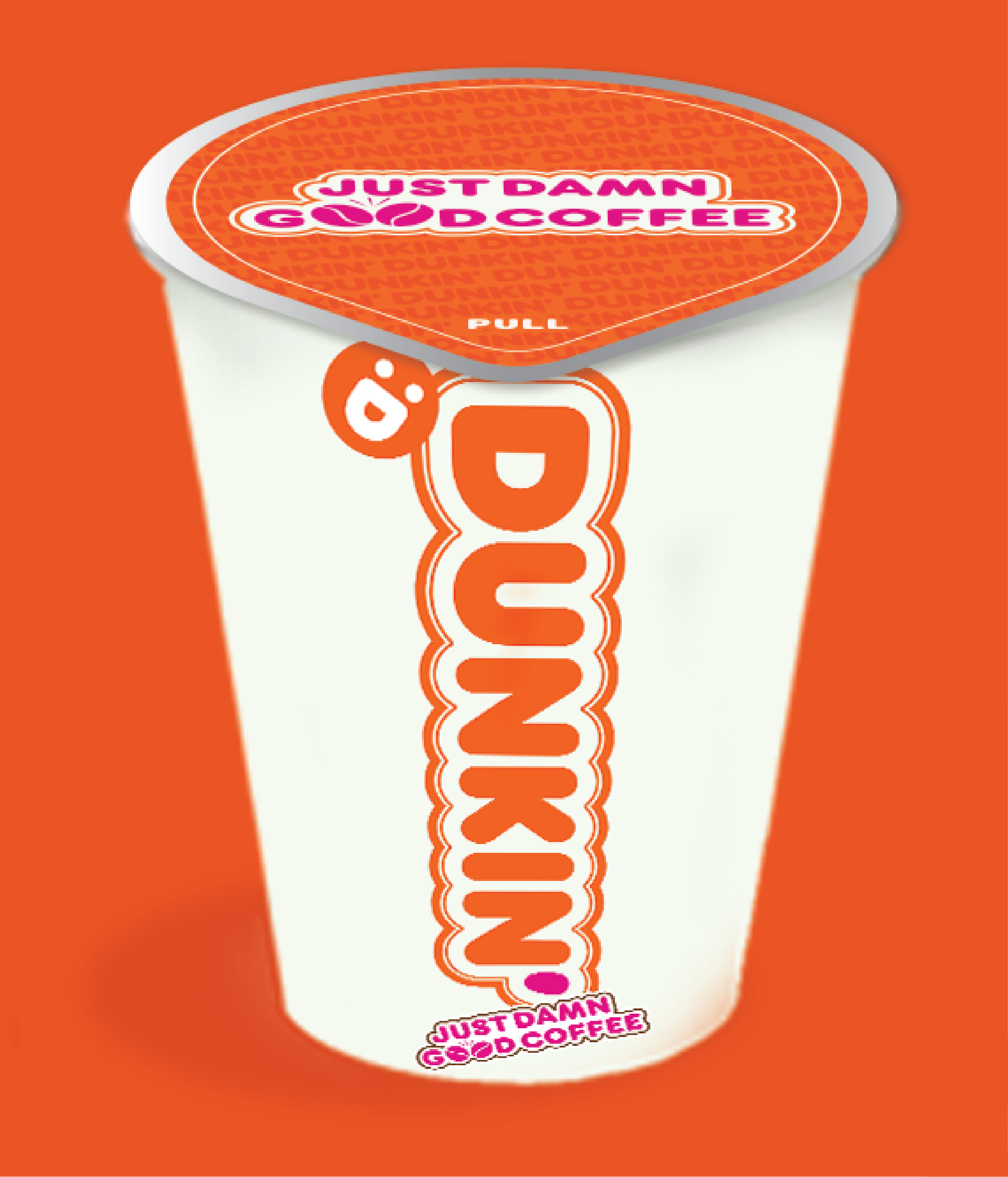
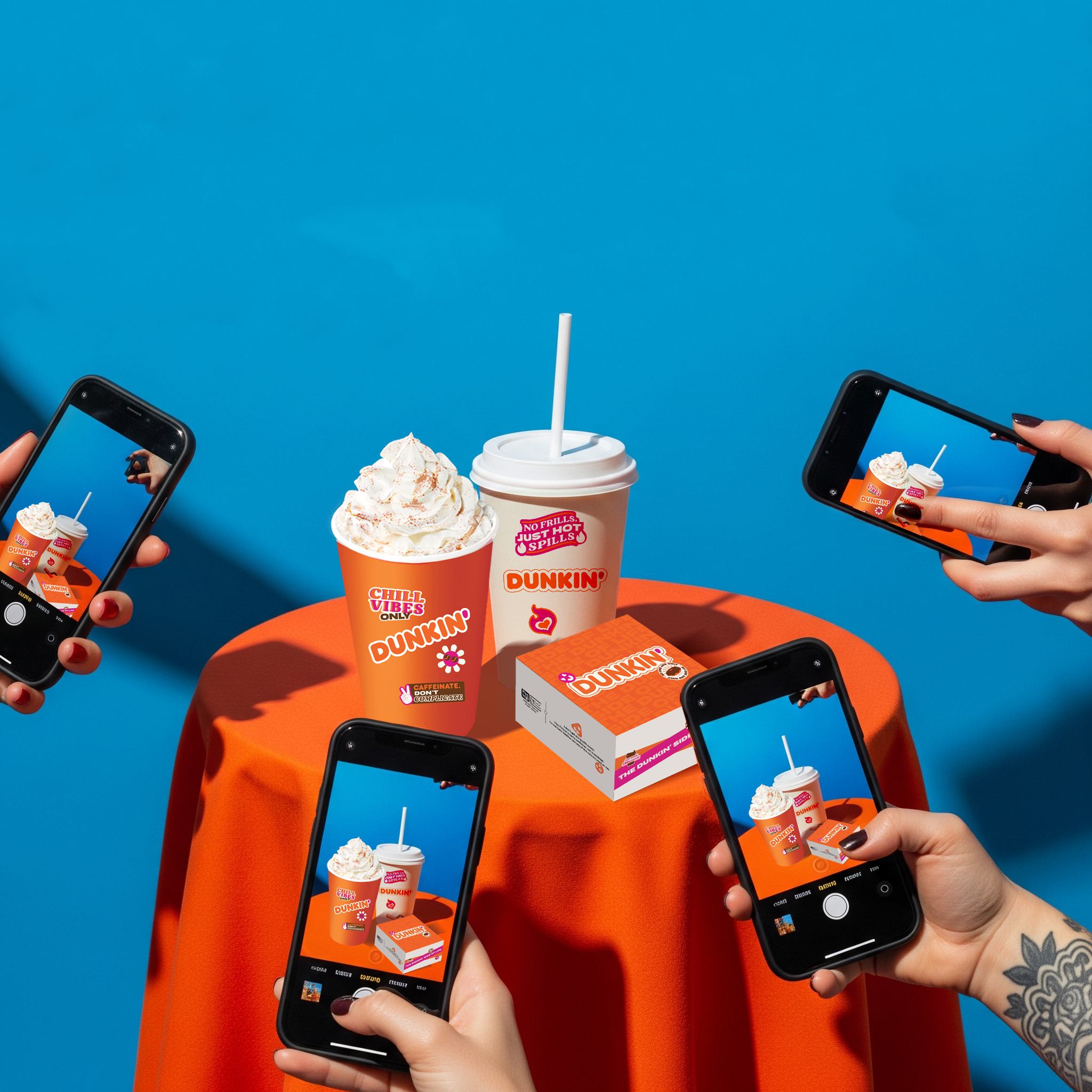
We built a bold, expressive design language and a tone of voice that doubled as a tool for self-expression. Every element, from packaging to signage was designed to be snapworthy, scroll-friendly, and proudly no-filter.
The result? Dunkin’ evolved from a kid-friendly donut brand to the coolest, most down-to-earth hangout spot for young people.
Services
Packaging Design
Client
Dunkin’
Year
2025
The logo & brand tagline
The logo modified to better fit the visual world of the consumer coupled with a tagline that makes a bold statement.


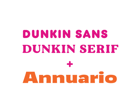
Colours and Typography
Playful colours and punchy type mirror the brand’s fun, expressive personality — vibrant, youthful, and impossible to ignore.
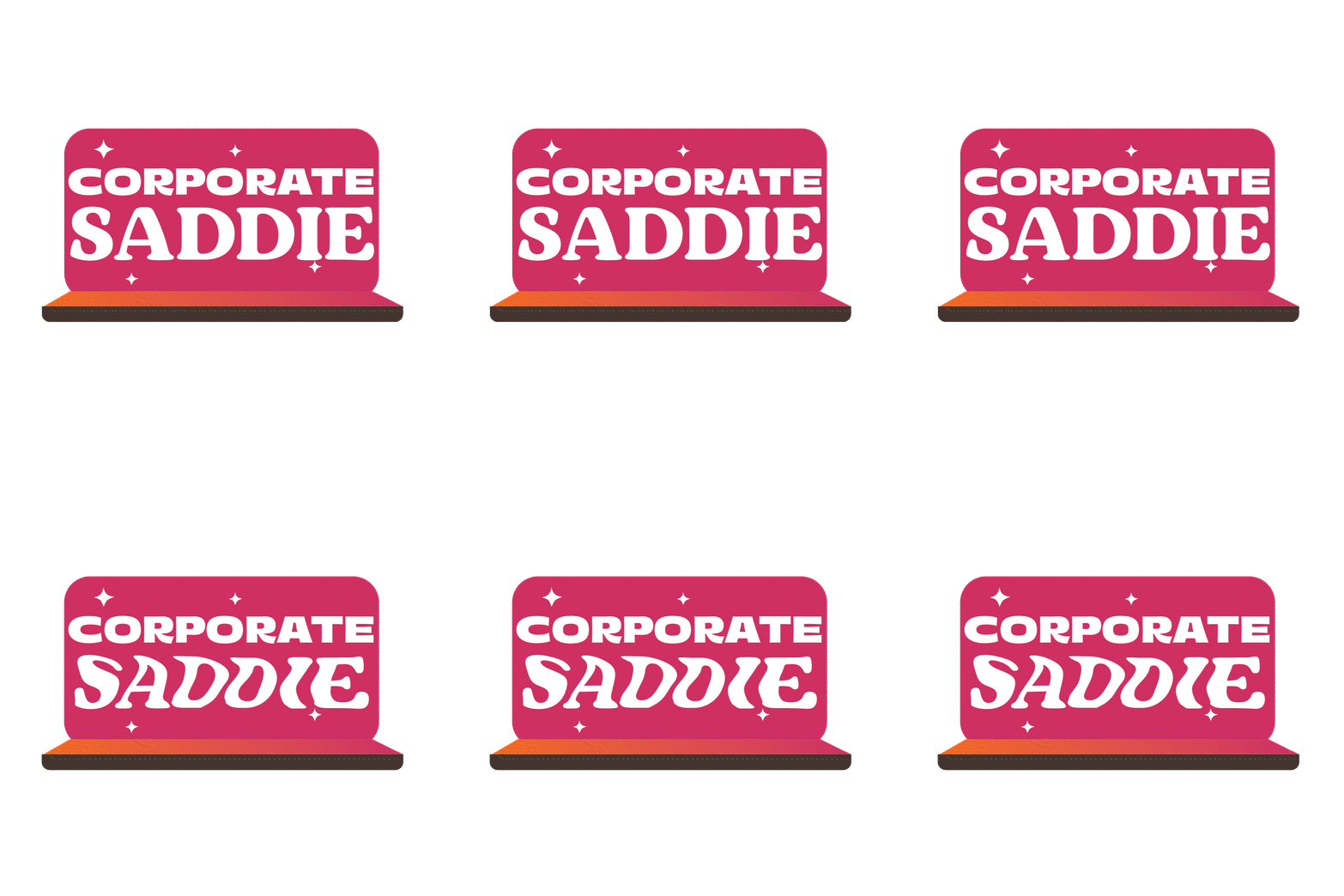



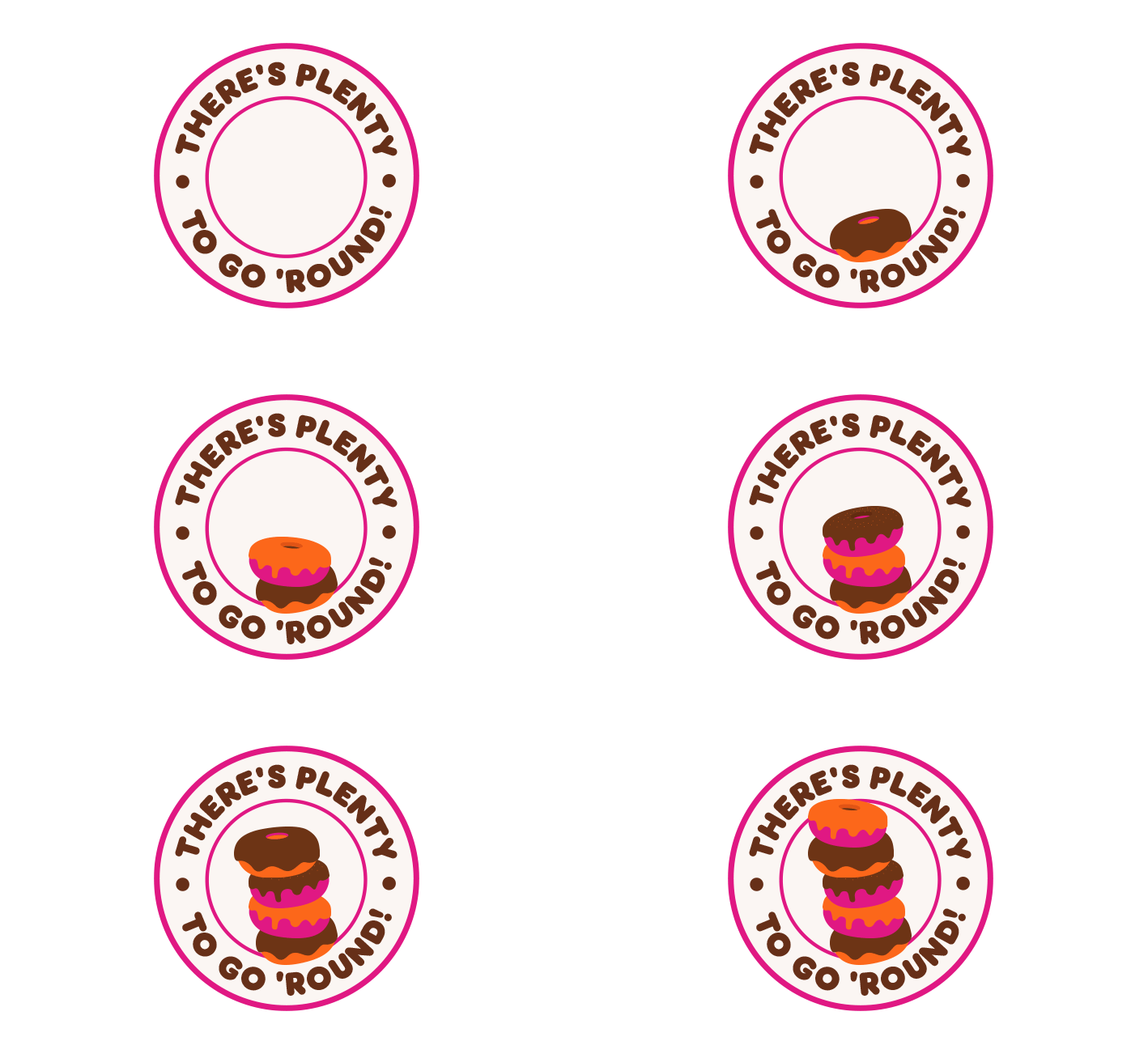
The Stickers
Designed to vibe with Gen Z, our stickers use bold statements, quirky visuals, and inside jokes, making every cup a canvas for self-expression.
The Dunkin Emojis
We created a custom emoji set that turns everyday Dunkin’ moments into expressive, shareable icons, adding a layer of playful relatability to the brand.






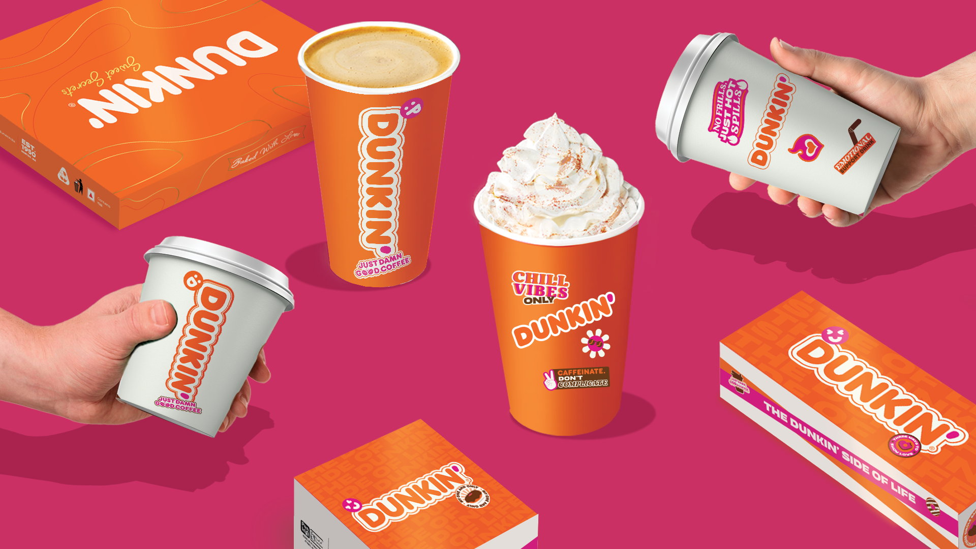
Cups and Boxes
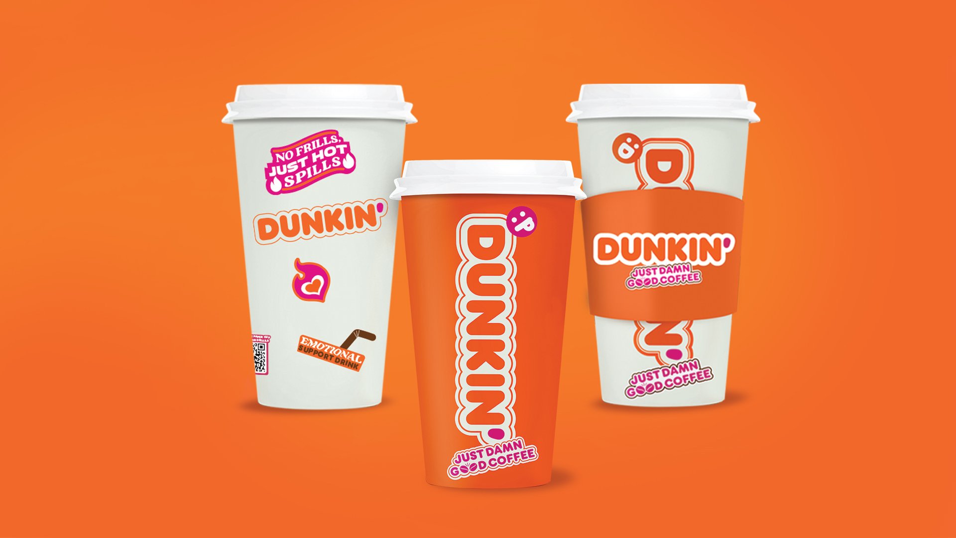
Cold and hot cups with sleeve
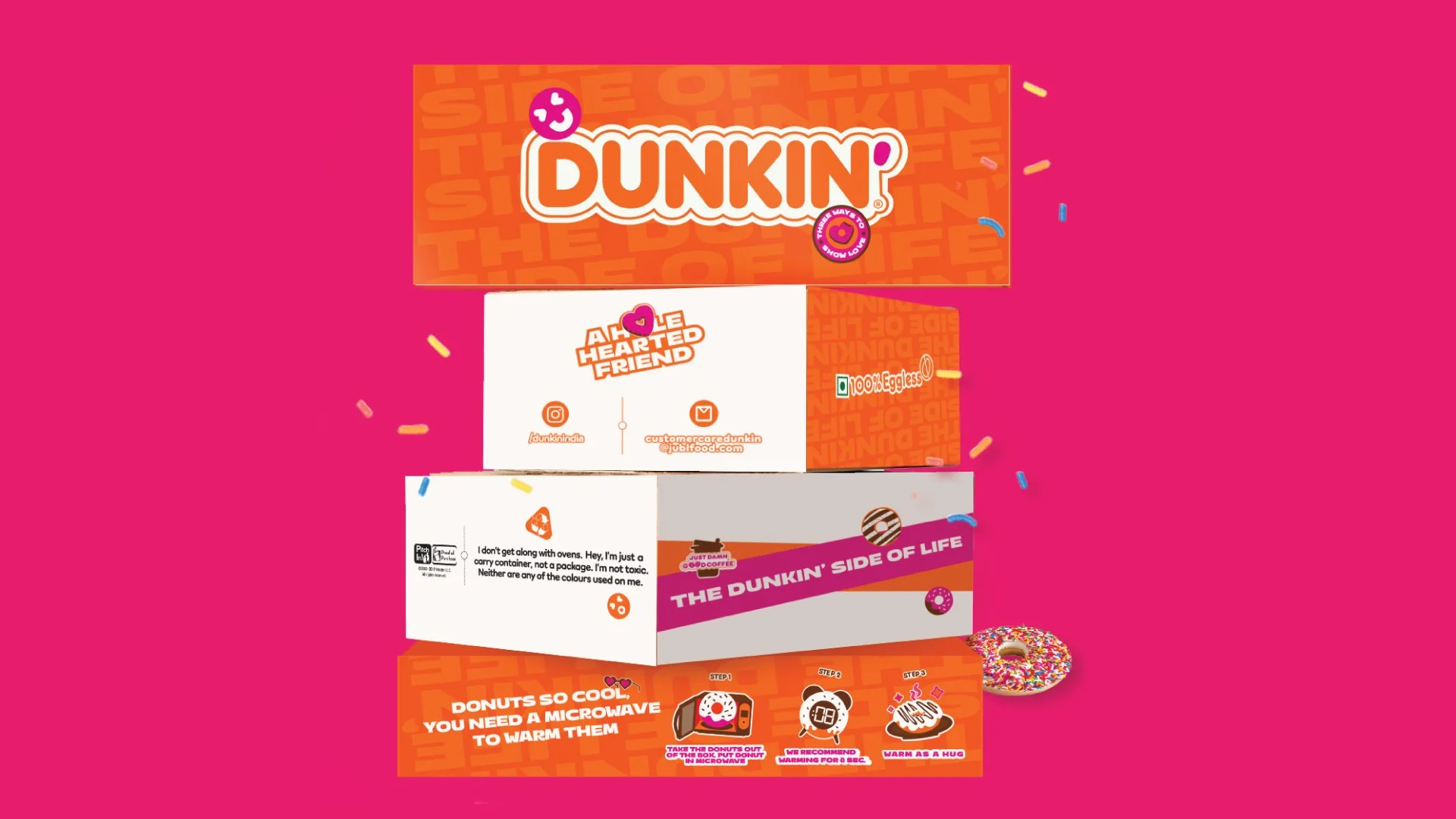
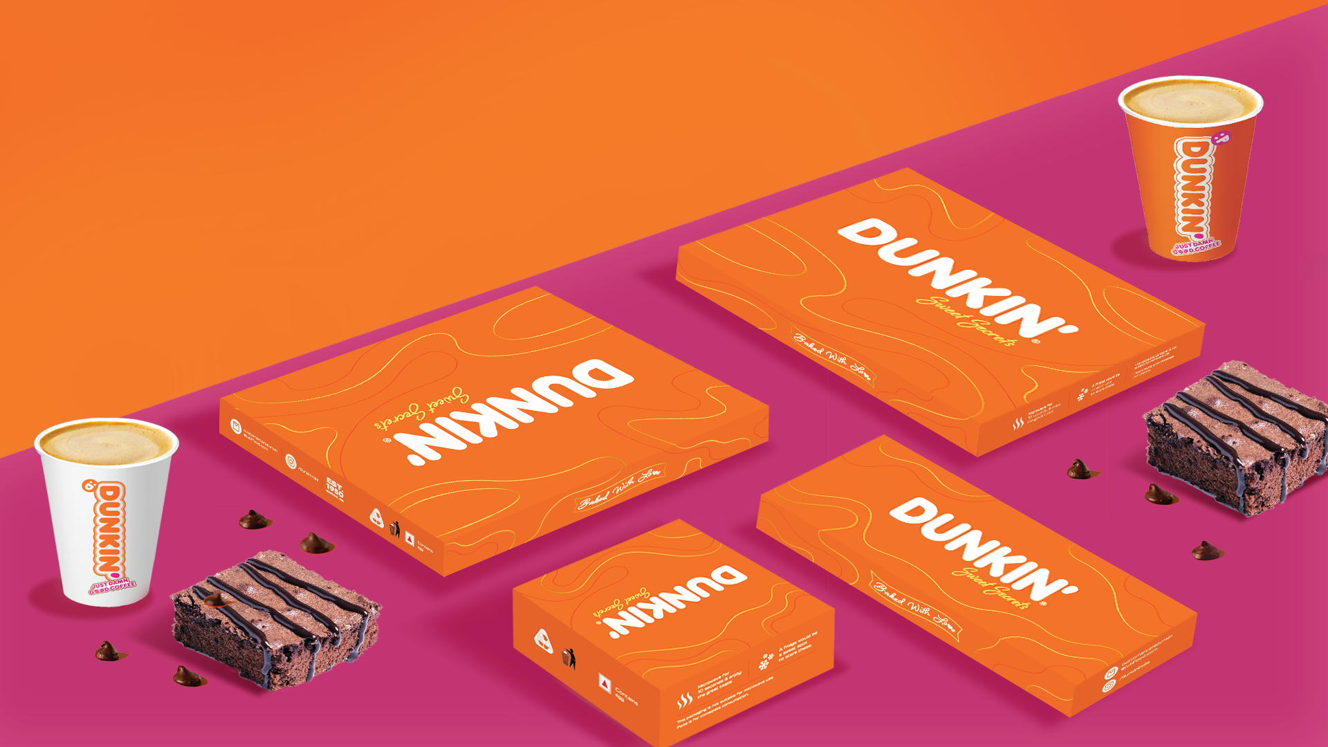
Brownie Boxes
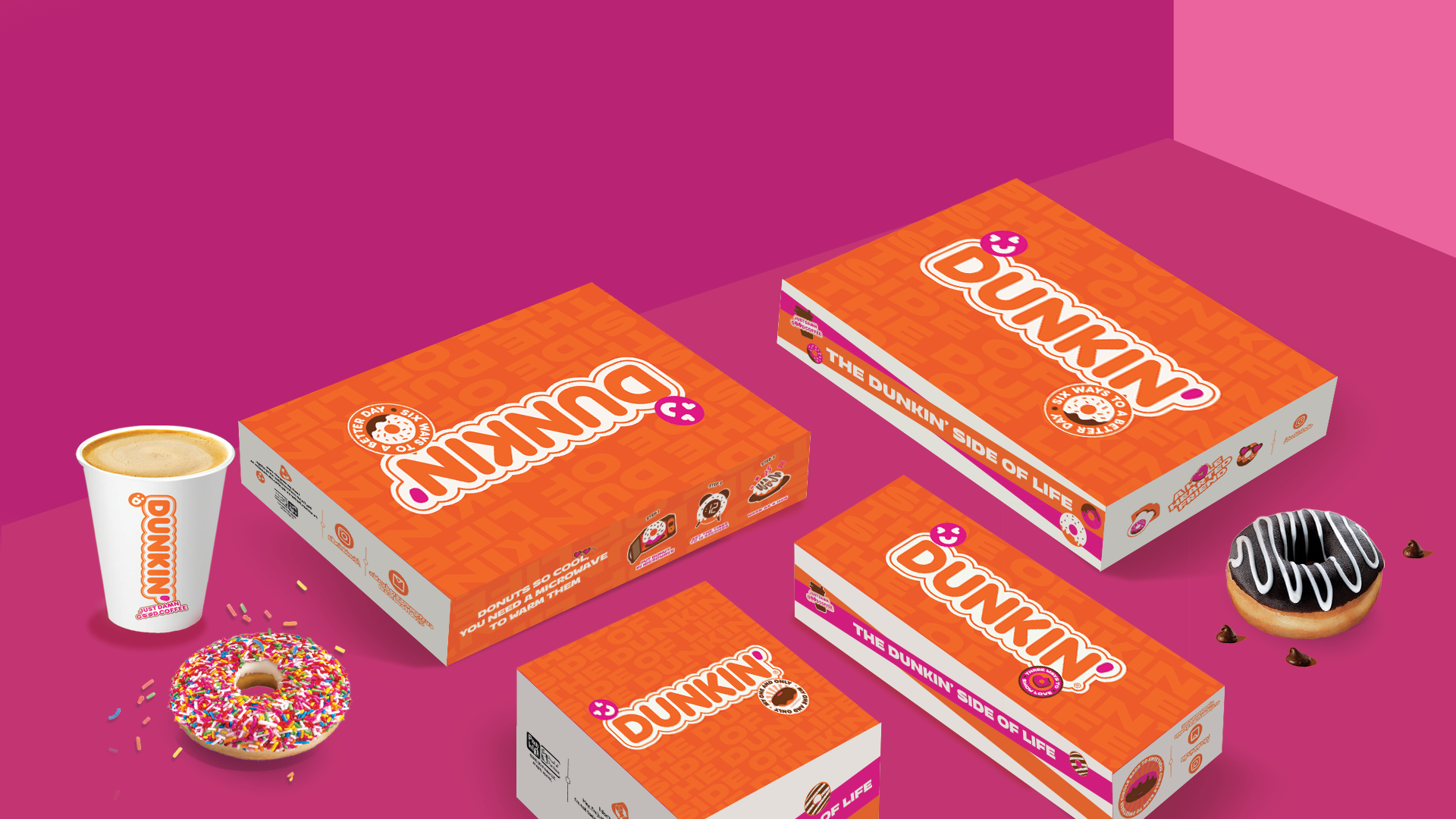
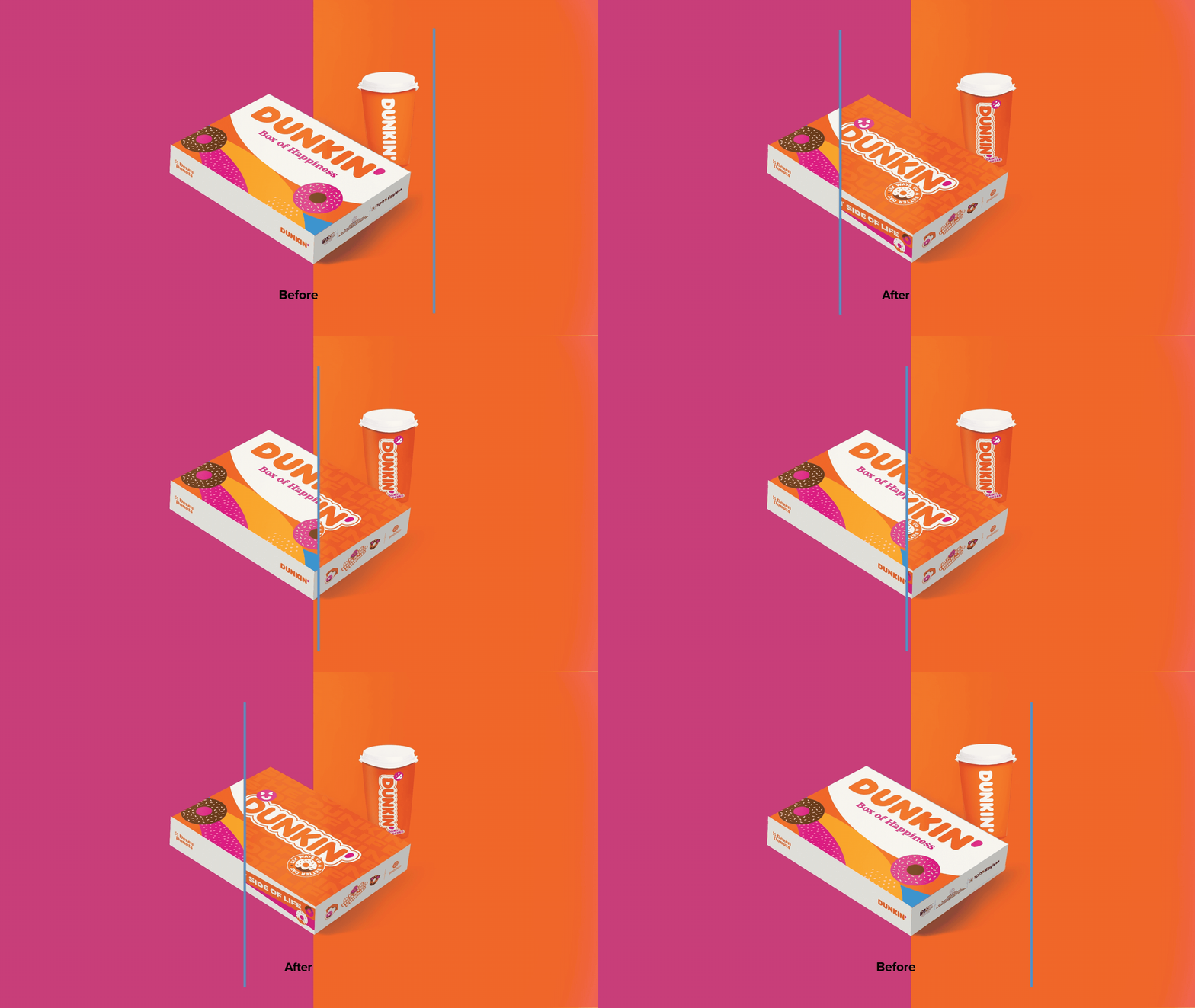
Donut Boxes
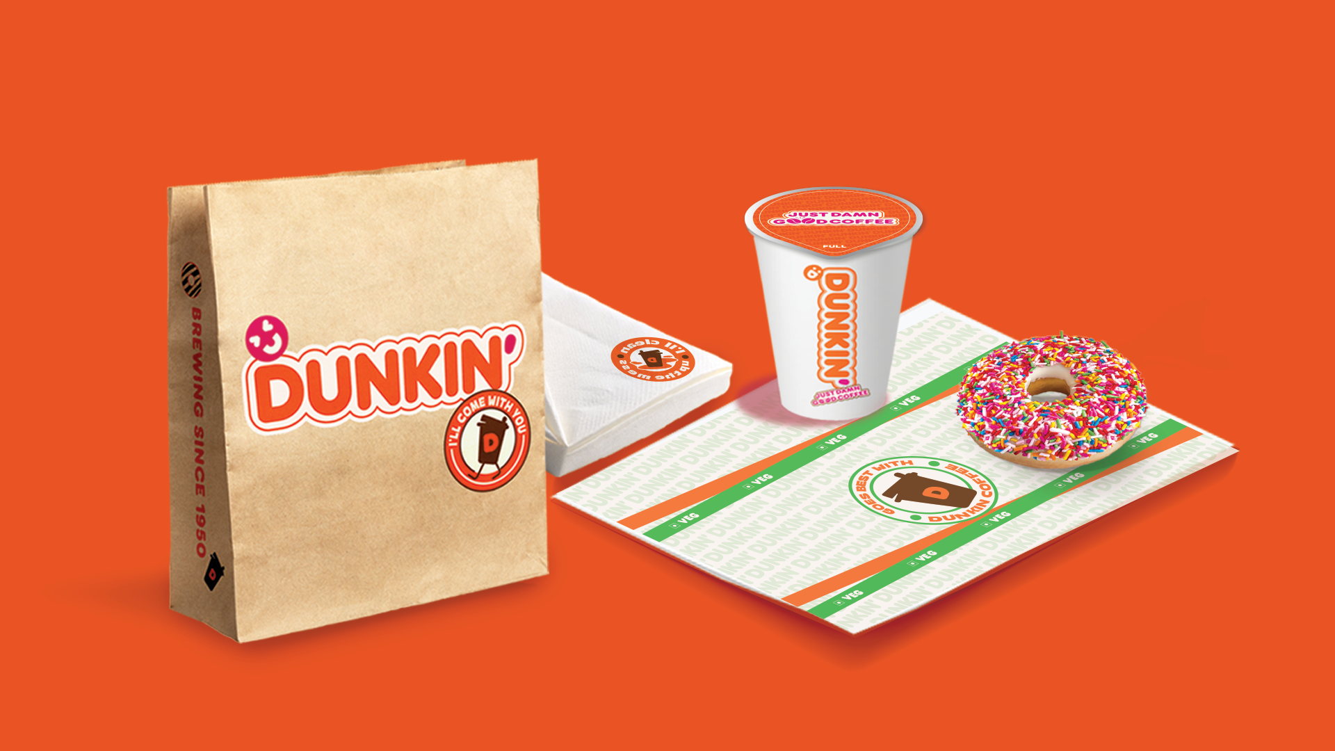
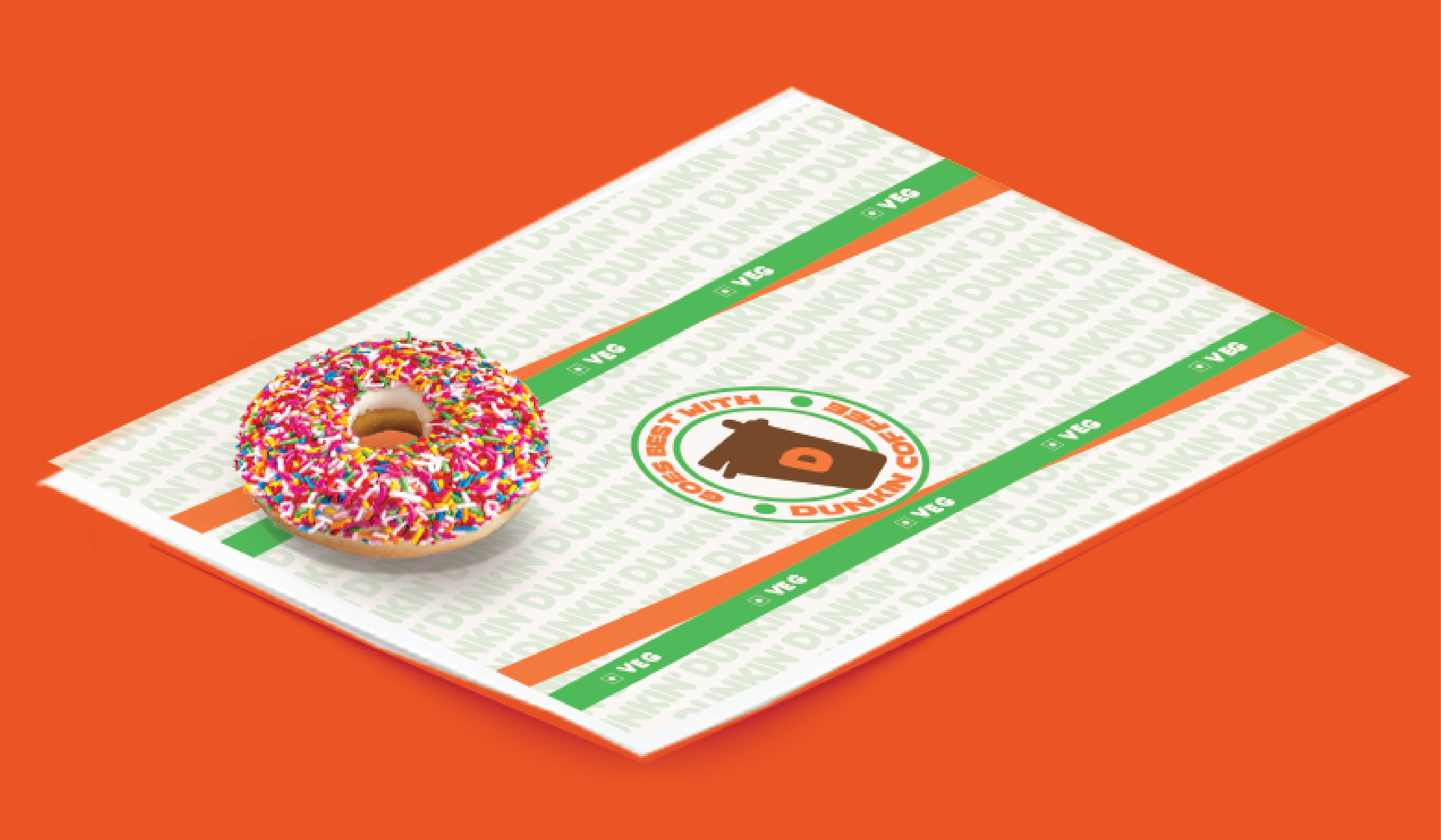
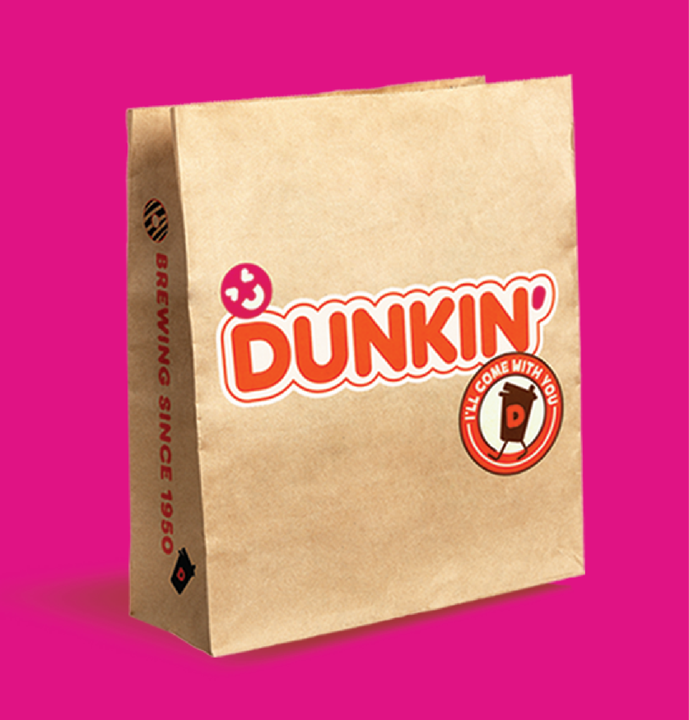
Takeaway bag, Wrapping Paper, Tissue, Hot Cup foil
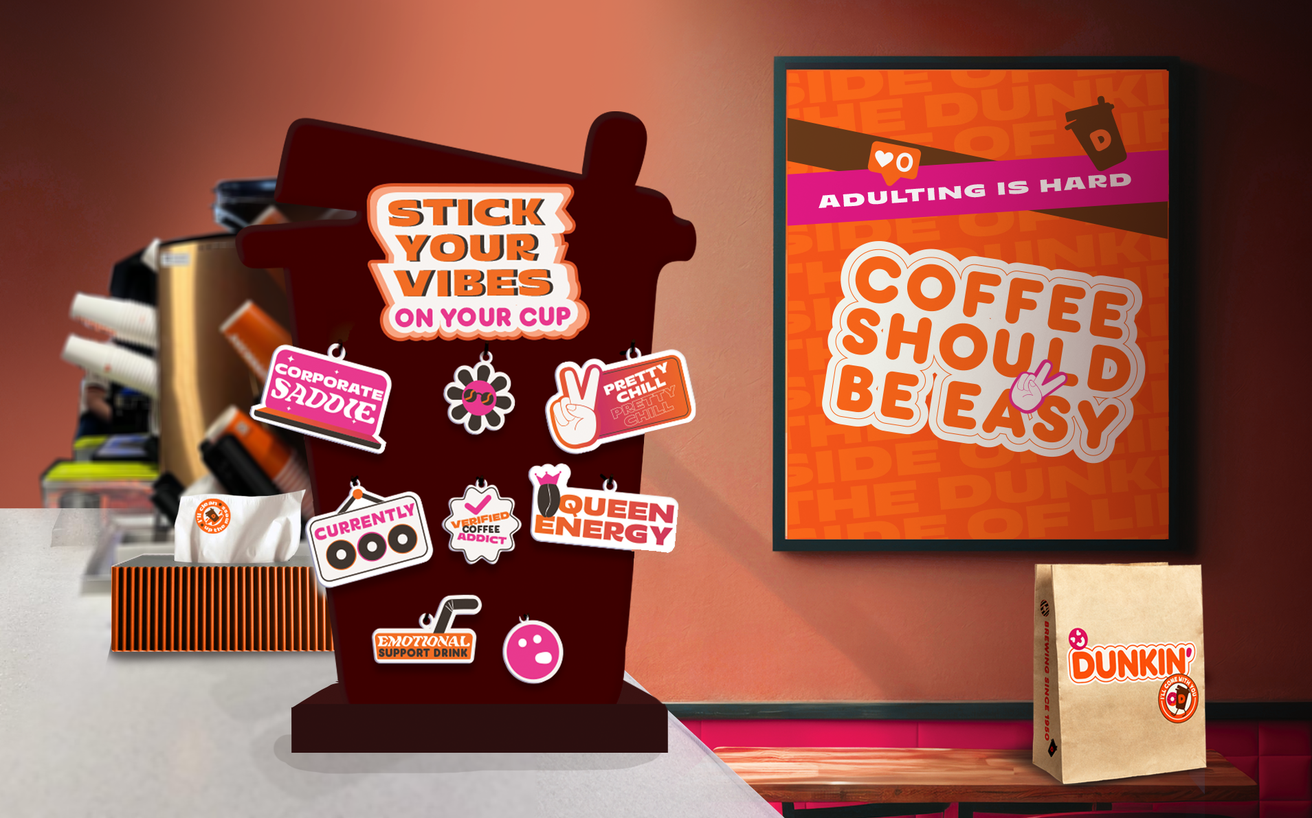
The Sticker design language lends itself to the store design.
Shouldn’t the brownie and donut boxes’ logos all face down?
The descriptors below sliders are too tiny and lost.
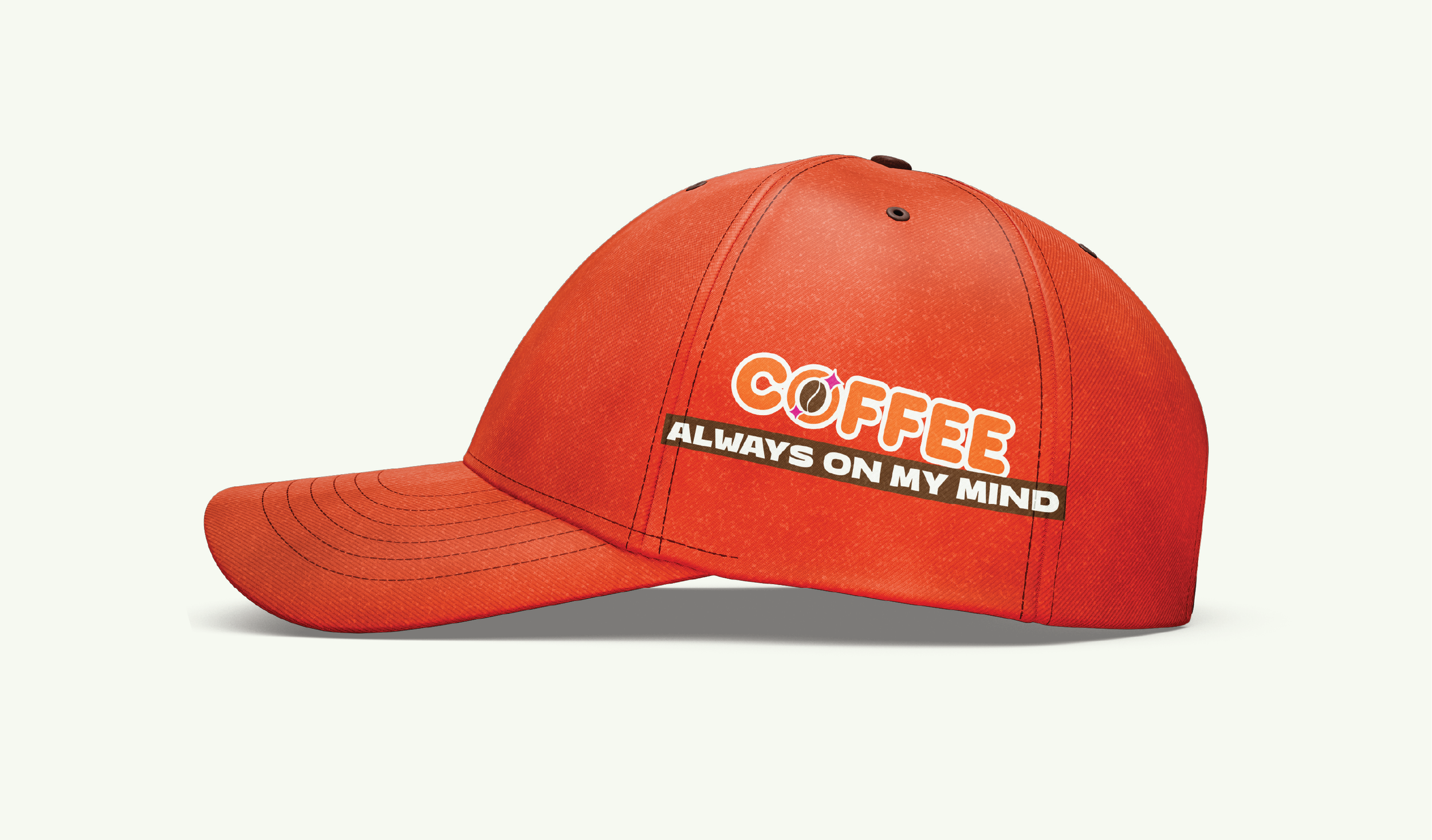
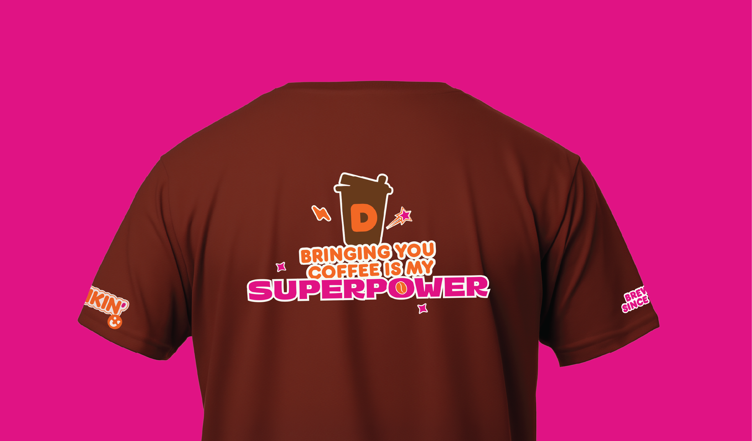
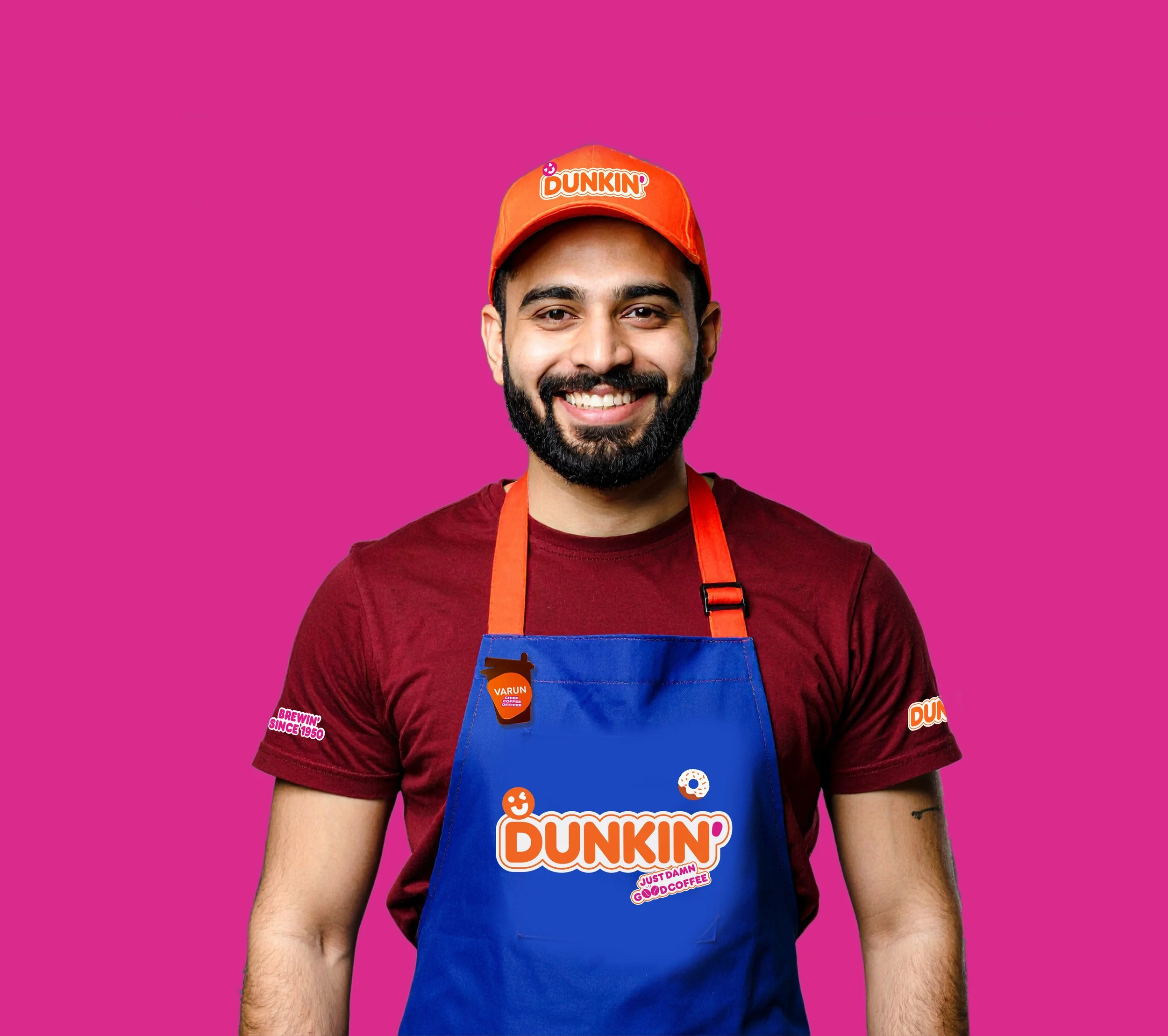
Collaterals