VIM PROCLEAN - Tackling category blindness to launch a premium offering
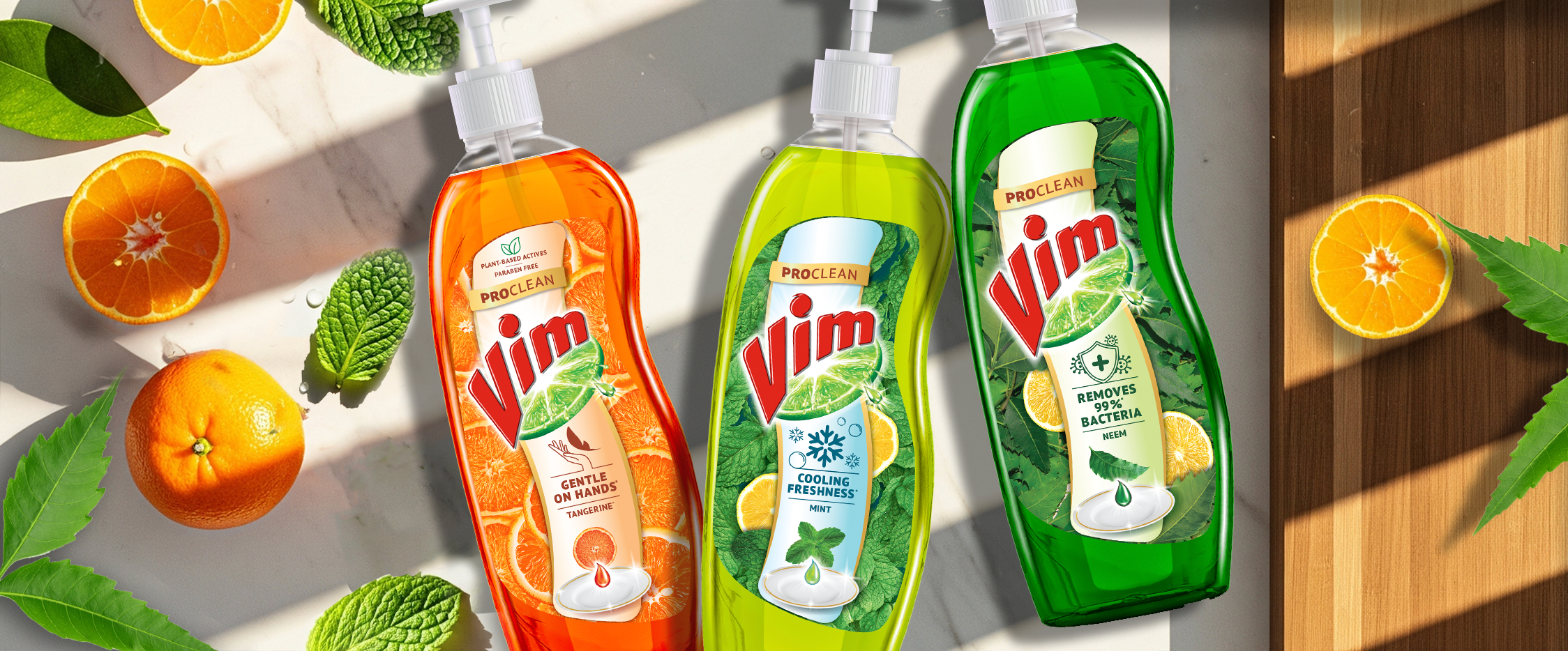
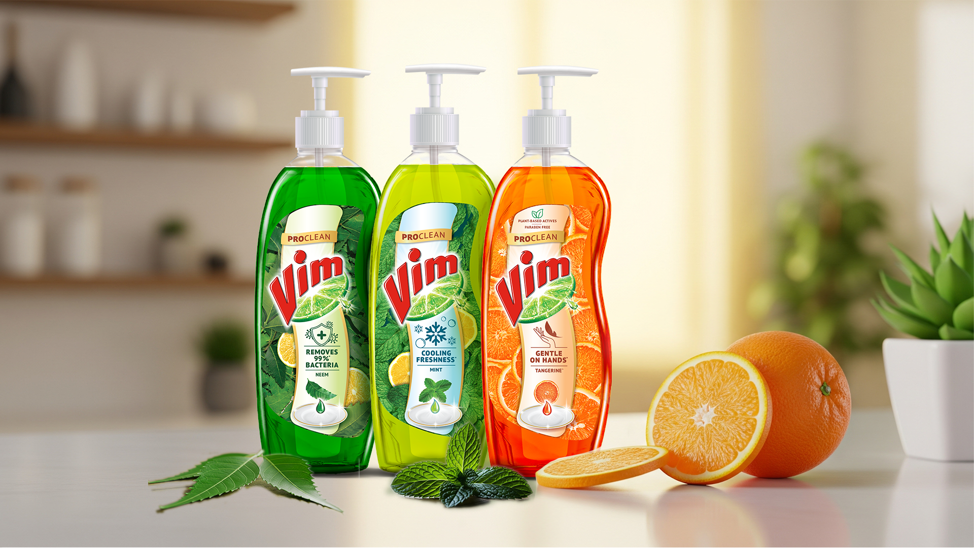
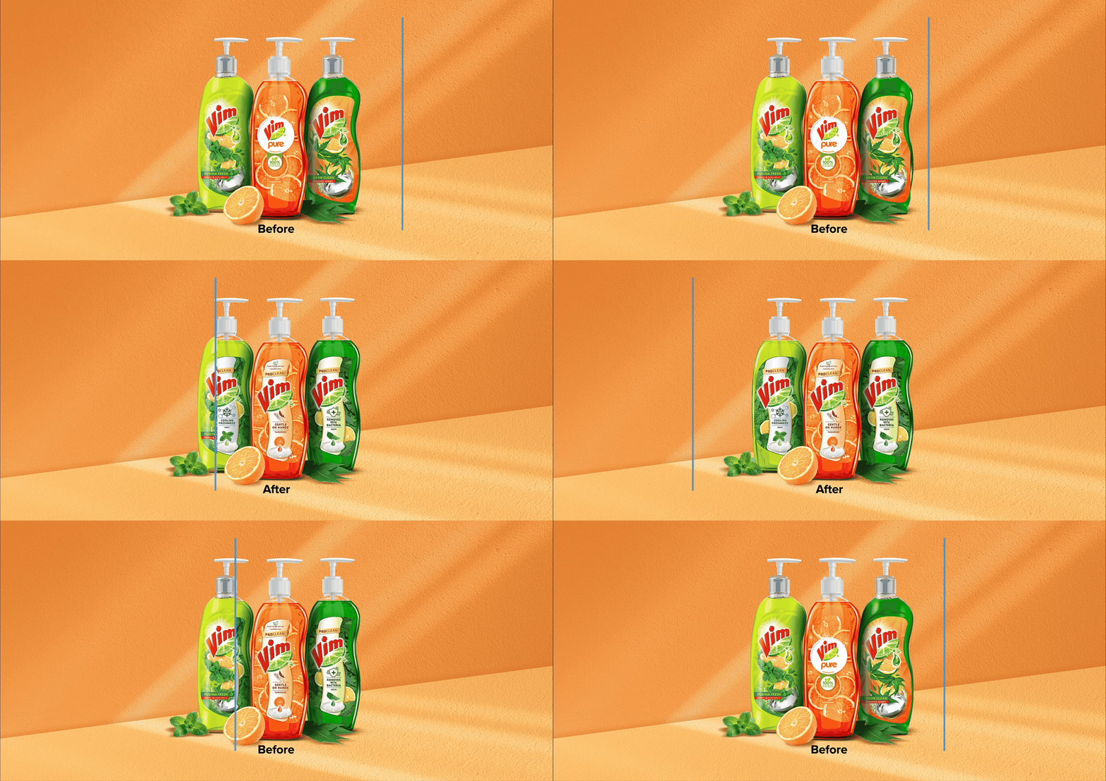
When you dominate a category, consumers tend to buy on autopilot and often miss the innovation. To help Vim launch its new premium range, we designed a deliberate visual break on the shelf.
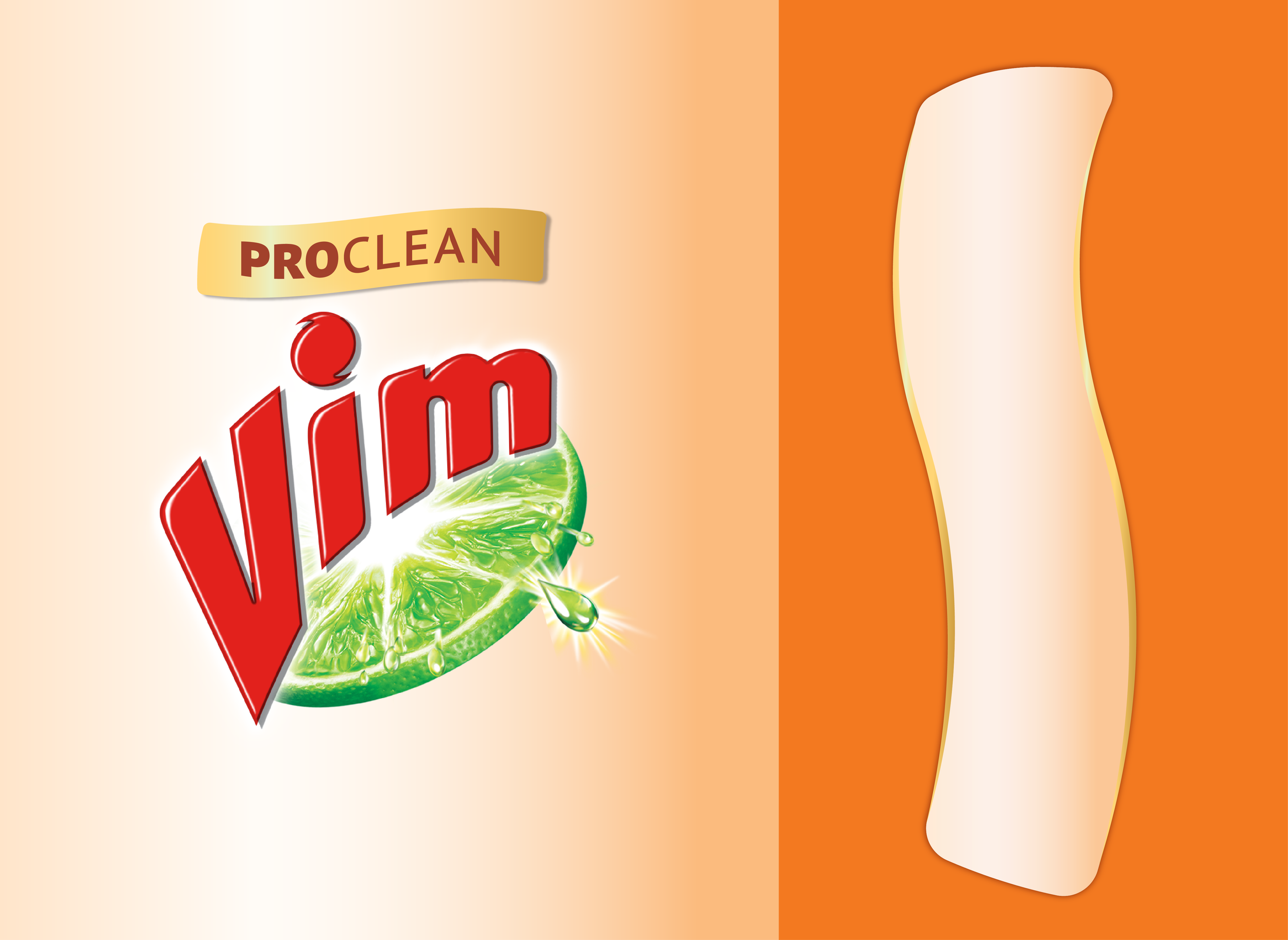
We created a powerful DBA inspired by active cleaning to hold key product benefits, shifting the logo placement to slice through visual clutter. By pairing this with refined, personal care-inspired ingredient imagery, we gave Proclean a distinct, sensory-rich identity that demands attention on shelf.
Services
Range nomenclature, Packaging Design
Client
Unilever
Year
2024
ProClean lockup
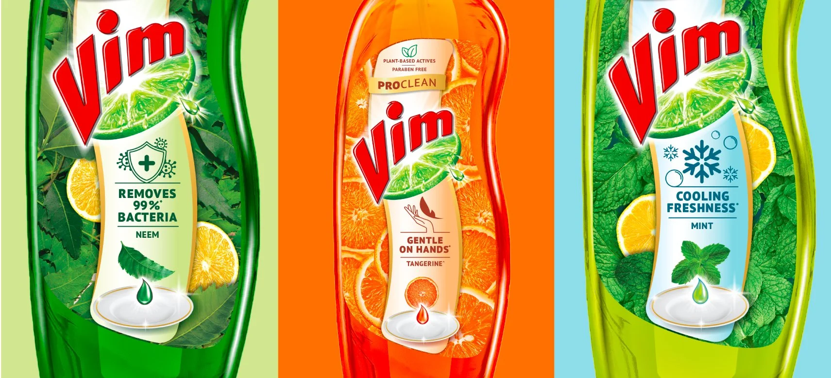
The ProClean callout sits boldly at the top of Vim logo to capture attention. The swoosh inspired by cleaning action becomes the holder of all information.
Abundant Ingredients
Lush, vibrant ingredient imagery highlights freshness thus elevating the sensorial appeal.